Three color palettes are dominating Bay Area design boards this year, and they are showing up in florist proposal decks from Napa to Half Moon Bay. Terracotta warmed by rust and clay. Sage grounded with olive and eucalyptus. Champagne pushed toward buttery gold rather than pale beige. None of these are new, but the way planners are building around them in 2026 is more specific than the Pinterest-era version, and the venues that flatter each one are not always the ones couples first pick.
This is a working roundup of what each palette does well, what it fights against in Bay Area light, and where it actually lands on a wedding day.
1. Terracotta with clay, rust, and burnt sienna
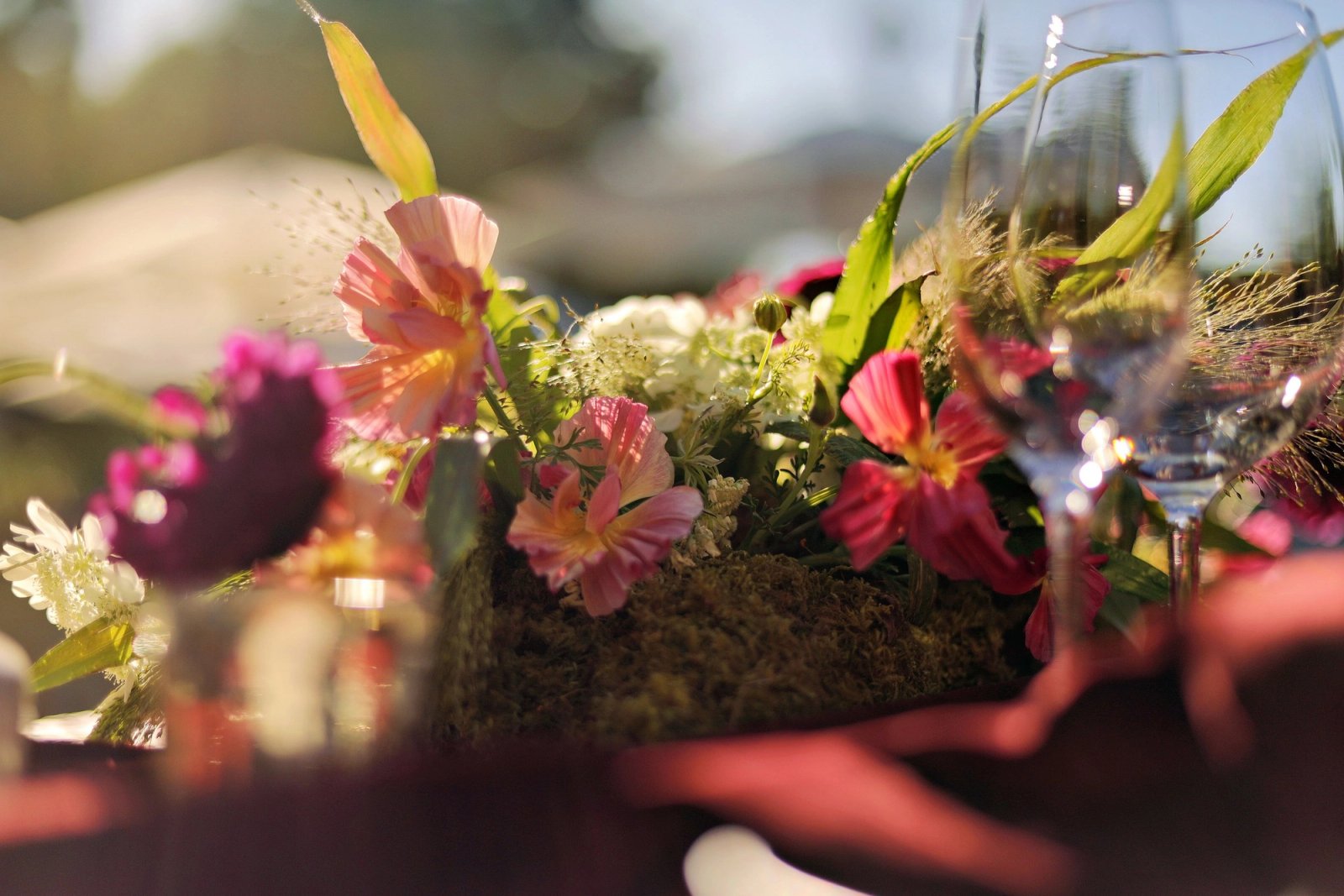
Terracotta reads warmer in person than on a screen. On a hot inland afternoon at a Livermore or Napa vineyard, it looks alive. On a coastal fog day in Pacifica or Half Moon Bay, it can go muddy fast. The palette works best when a florist layers three depths: a soft peach at the top, terracotta in the middle, and a rust or oxblood accent that keeps it from tipping into a Southwest resort look.
Best paired with warm wood tables, unpolished brass, and dusty pink candles. Avoid pure white linens; they fight the palette. Ivory, oat, or a light putty linen holds the composition together in photos.
Where it flatters the venue
- Casa Real at Ruby Hill and other Livermore vineyard estates, where warm afternoon light meets stone.
- Estate Yountville and other Napa outdoor courtyards with terra tile or brick underfoot.
- Cornerstone Sonoma installations where the palette echoes the surrounding sculpture gardens.
- Any Peninsula estate with existing warm brick or Spanish-tile detailing.
2. Sage with olive, sage-and-white, and eucalyptus
Sage is the palette most Bay Area florists say couples ask for by name in 2026. The reason it works: sage is not a color so much as a temperature. It calms warm venues and warms cool ones. It photographs well in fog and in full sun. It plays with almost every skin tone in a bridal party.
The mistake is using only one shade of sage across every element. A well-built sage palette in 2026 uses at least three greens: a silvery eucalyptus, a deeper olive, and a proper sage that carries the ceremony arch. Add cream, not stark white, and consider a soft blush or a pale ochre as the single accent that keeps the whole thing from feeling like a produce aisle.
Where it flatters the venue
- Nestldown and other Santa Cruz redwoods venues; the palette echoes the canopy without competing with it.
- Filoli Historic House and Garden style events (private events only) where the existing hedges do half the work.
- Presidio venues where the eucalyptus outside the window becomes part of the arrangement.
- Marin barn and farm venues where warm wood needs a cool counterpoint.
3. Champagne pushed toward buttery gold
Champagne is the palette couples pick when they want understated formality, and it is the palette that goes wrong most often. In 2026 the version that is working is warmer than a decade ago. Think butter, honey, and a hint of gold rather than pale beige or blush. The florals lean toward cream garden roses, butter yellow ranunculus, and a touch of dried grass or wheat for texture.
Champagne suffers most under cool overhead LED. If your reception space runs cold or industrial, this palette will need warm-white bistro lights and candles at every table to look intentional rather than accidental. Ask your florist to bring a swatch to a site visit at the actual time of day of your reception.
Where it flatters the venue
- The Ritz-Carlton Half Moon Bay and other ocean-bluff properties where the fog reads as luxe rather than gray.
- San Francisco City Hall receptions where the existing marble and gold detail already speaks the language.
- Kohl Mansion and other Peninsula historic estates with existing warm wood paneling.
- Napa and Sonoma indoor barrel rooms where warm wood already carries the temperature.
4. How to mix, extend, or reject these palettes
None of these palettes are laws. They are starting points, and the couples who use them best treat them as such. A terracotta palette with a single deep aubergine accent for boutonnieres reads more editorial than a straight terracotta board. A sage palette with a slate blue signage moment picks up on the fog outside without leaving the family of tones. A champagne palette with a single black tie moment (a black napkin fold, a black menu card) can look intentional rather than beige-on-beige.
Where couples get in trouble is combining palettes. Terracotta and sage together can work in the hands of a great florist, but it needs a firm hand on ratios; think eighty percent one and twenty percent the other, not a fifty-fifty compromise. Champagne with sage almost always works. Champagne with terracotta needs more contrast to keep from muddying.
A quick sanity check before you commit
- Ask your florist for a mood board using photos taken at the actual venue, not stock images from a different climate.
- Test your invitation ink and menu card colors under warm bulb, not phone flash.
- See a full centerpiece sample in the actual reception room at the actual ceremony hour.
- Check bridesmaid dress swatches under the ceremony light, not the store fluorescent.
5. What this looks like on a working budget
None of these palettes are more or less expensive than another in themselves. What drives cost is the number of focal florals, the ceremony structure, and whether the palette relies on out-of-season blooms. Sage and eucalyptus are the most forgiving on cost because greenery is available year-round and travels well. Terracotta pushes toward garden roses and ranunculus, which are seasonal and get pricey outside the March through June window. Champagne with garden roses is the palette that most reliably absorbs a budget overrun; buttery cream garden roses can cost double a standard rose stem.
If any of these palettes speak to you, start by booking a florist consult before your venue is fully locked. The best florists in the Bay Area book six to twelve months out, and they will tell you honestly which palette flatters the space you are considering. That single conversation saves more design money than any Pinterest board.
Browse Vendors